Friday, November 13, 2015

Week 10: Infographic


         This infographic was constructed to showcase the evolution of the Christian cross. This was made using Adobe Illustrator. There was a lot of skill used to make this considering that it take skill a great skill in computer programs to understand how to execute a successful design. Such tools in the program that was used would be color, copy & paste, pin tools, and more along with the skill to draw my ideas with manually. In all, the steps were simply to make a layer, create points of different objects such as the continents and the color coated system, and more.


         This infographic was made to appeal to the sight of the audience. The layout of the map with its different continents, crosses, and guided text will allow other to understand it. I arranged it this way so that I can easily create a color-coded system and merge time into it with or with out it. The first thing that is supposed to be seen is the continents, and the second things seen is a text box that introduces and shipped locations is.

The use of the brain in this infographic is that the left side begins to work due to the rise and others on the right slow out. The overall message that is going to be told is that the Christian cross has been changed for hundreds of thousand of years. This sacred symbol of a living sacrifice was not just know in America but in other countries such as Spain, Egypt, and Christo.

Week 8: Infographic 1st Draft

Creating Infographics


       This is my first attempt to create an infographic using adobe illustrator and creative website tools.


Evolution of the Christian Cross
Adobe Illustrator
10/20/19


Craft
This infographic was constructed to showcase the evolution of the Christian cross. This was made using Adobe Illustrator. There was a lot of skill used to make this considering that it take skill a great skill in computer programs to understand how to execute a successful design. Such tools in the program that was used would be color, copy & paste, pin tools, and more along with the skill to draw my ideas with manually. In all, the steps were simply to make a layer, create points of different objects such as the continents and the color coated system, and more. In this one, the crosses are laid on top of the continent to show where it came from. Also, the continents are made of many colors to bring more contrast between them.
Concept 
         This infographic was made to appeal to the sight of the audience. The layout of the map with its different continents, crosses, and guided text will allow other to understand it. I arranged it this way so that I can easily create a color-coded system and merge time into it with or with out it. The first thing that is supposed to be seen is the continents, and the second things seen is a text box that introduces and shows where the locations of the featured cross. Though the text box is the largest add-on, it is not relevant to the crosses except for guiding the viewer through a timeline of when and where the cross originated from.
Composition
           The use of the brain in this infographic is that the left side begins to work due to the rise and others on the right slow out. The overall message that is going to be told is that the Christian cross has been changed for hundreds of thousand of years. This sacred symbol of a living sacrifice was not just know in America but in other countries such as Spain, Egypt, and Christo. The first pace to look would be mostly the text box because it is big and it also gives instructions. it is from there that the piece would be understood and further navigated.

Week 4: Refined Letters

Crazy Red Crunchy Font
Adobe Illustrator

Craft
           This infographic was constructed to experiment with the stools of adobe illustrator. The purpose was to use the tools provided to stylize text and create new fonts in preparation for created artworks. The tools in the program that was used would be the paint brush, copy & paste, pin tools, and more along with the skill to draw my ideas with manually.
Concept 
         This created font was made to appeal by sight. The use of the style of thick boarders brings out the outer edges of the font. It appears to be very crinkled, chalky, and crunchy, which is why it is an original font because it is stylized differently than others fonts.
Composition
           The parts of this font that should stand out should be the edges. This is because they are creating contrast both surrounding the letter and outlining the negative space. In this, the letters portray themselves as more than slim, straight figures like other formal letters but as crazy, rebellious, figures that can do the same.

Wednesday, October 21, 2015

Week 5: Word PIC


      The craft of this piece is that is was made in Adobe Indesign. The tools used to make it were among the pen tool, rectangle marquee, the paint brush, text tool, gradient tool, and more. The steps for this to be crated was to make three layers. Layer one was for the background, layer two was for the image, and layer three was for the text. Altogether, these steps help create this word picture.

The composition of this piece is that the eyes should be directed to the hieroglyph of the kemeite man. The idea around the entire hieroglyph is that he is delivering spirits unto the country. It is the duty of the men of the country to pray for abundance and victory for the country so that war and survival will follow the years to come in Egypt.
The concept of this piece is that even though there is no true trace of the real egyptains, the world can learn from theri culture that we as people in our respective countries should pray and seek God for the protection and goodness of the country and even the world.

Wednesday, October 7, 2015

Week 6: Best Infographics

             
               The integration of strong graphics (large central image, topography, color/theme) visual data (charts, graphs, and color codium) and information (stats, dates, sales, and analysis) all are fundamentals for infographics.

Geographic Infographic # 1: Burger Chain
Geographic Infographic # 2: 
World Wide  Social Class Rate

   
Geographic Infographic # 3: Most Livable

Craft
The infographic above was probably made using a professional and private program run by a company. In the program, it allowed the creator to construct a blank canvas. From there, the use of tools such as pens, brushed, formula creators, shapes, and more are needed to demonstrate statistics and images. There is also the use of text and changes in fonts to make reading easy and isolate things by important using italics, bold, and more.

Concept 
         This infographic was made to appeal to the sight of the audience and to inform them about major cities and how they are the most livable. The pie charts show the percentage of people living in the city. The Red text cover tell the viewer the most livable city that is most important. The last thing is the green text cover that show nearby cities that could be a candidate.
Composition
         When viewing this infographic, the audience has to pay most importantly to the cities defined in red and the blue outlined percentages. The real purpose of this infographic is to inform the audience on the most livable cities. This infographic is trying to say that the cities Melbourne, Vancouver, and Helsinki are the livable with Melbourne being the first. 

Monday, September 14, 2015

Week 3: Letters

        As of now, this is the best that I can do when creating simple font silhouettes. Now, I will begin to stylize my fonts to make them look more personalized and crafty.

Now that I know how to use the software effeciently,  can draw, clean, and stylize my fonts to make them look more like my own work of art. #FULFULLING-POST MODERN-AGE-OF-ART
ABC Simple Draft Font
Techno Futuristic Font


Craft
This piece was constructed to experiment with the tools of adobe illustrator. The purpose was to use the tools provided to stylize text and create new fonts in preparation for created artworks. The tools in the program that was used would be the paint brush, copy & paste, pin tools, and more along with the skill to draw my ideas with manually. These are the things that were used to make this find achievable.
Concept 
         This created font was made to appeal by sight as well. The use of the style of thick boarders brings out the outer edges of the font. I also added a hint of eraser to make the smooth outlining narrow and bumpy. I made this addition so that the font would has some type of future taste to it. Now, instead of looking at the edges of the letter because it has more contrast, it is seen more because of it weird incomplete smoothness. As many would notice, the outlining is shifting a lot, thinning and bolding spontaneously. This is why the font is futuristic because it is somewhat boxy and unusual.
Composition
           The parts of this font that should stand out should be the edges. This is because they are creating contrast both surrounding the letter and outlining the negative space. The idea for this font is that text is eventually going to be this way because sloppiness is going to be in favor due to the long years of smooth fonts.

Wednesday, September 2, 2015

Week 2: 100 Lines


 Chichen Itza  


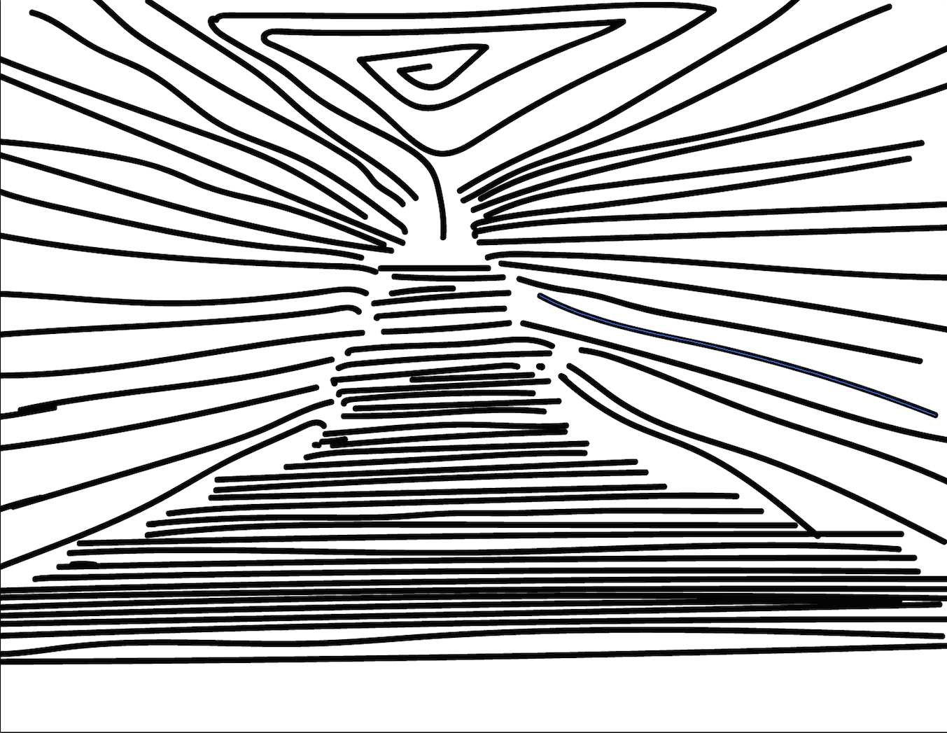
  There are many things in the world that are considered art; these things are objects or people that are identified as art potential. When something has art potential, it is recognized by the viewer, and if it is astonishing or interesting, then it will attract other. When the work of art is known well enough, it becomes a famous art piece; thus, it is brought to the attention of many who will judge whether or not it is as interesting as many say. When the art piece becomes world-known, it becomes a part of global recognition, and if there is no other art like it in the world, it may be called a world wonder. This creation is the temple of Chichen Itza, but was this the first product of this image. Well, of course not, there were other stages that made this brilliant piece of art.

        At first, it was a hand drawing created by the use of simple lines descending diagonally from a focus point. These lines continued to flow away from each other but still keeping a parallel position. Then, the lines began to break apart simultaneously, from simple straight lines into 3/4 views of a 2-dimensional square. It is here where the outermost of the temple is represented by the rough and step-like structure. In the center, the use of straight lines create the stairs or walk path through line perspective to show that the stairs and the whole temple, is gradually increasing from bottom to top. There are usages of the three points: craft, composition, and concept.

1.     Craft
a.     The use of digital tools such as crayons, markers, charcoal, etc. used in software.
2.     Composition
a.     The technique for strokes and brushings such as pulse strokes and small cross-hatching.
3.     Concept
a.     The use of thought to identify the most realistic way to create an image that looks ancient through charcoal brushes.